Scope and Goals
The scope of this branding initiative encompassed a comprehensive overhaul of Sara Transporte AG logistics' brand identity, including its visual elements, messaging, and overall brand strategy. The primary goals were as follows:
- Modernization: Develop a contemporary visual identity that aligns with industry trends and positions Sara Transporte AG as a great innovation.
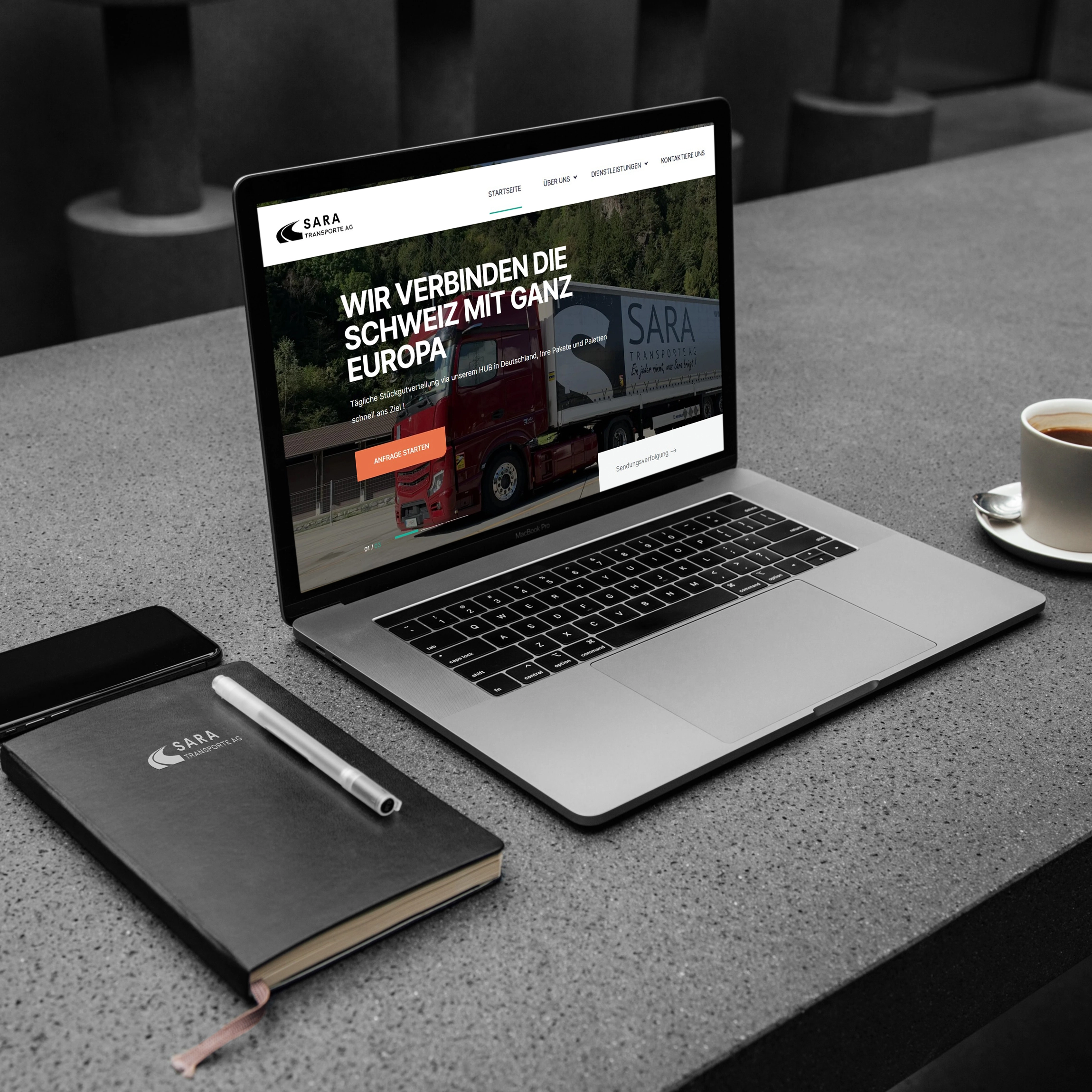
- Consistency: Ensure consistency across all brand touchpoints, from digital platforms to physical collateral, to establish a strong and recognizable brand presence.
- Expansion Readiness: Create a flexible brand identity system that can adapt to the company's expansion into new markets and services without losing its core identity.
- Engagement: Increase client engagement and establish emotional connections by communicating the company's commitment to reliable and personalized logistics solutions.
Visual Identity and Design
The new visual identity draws inspiration from the dynamism and interconnectedness of the logistics industry. The following design elements were developed:
- Logo: The new logo features a dynamic arrow motif that symbolizes movement, progress, and direction. The arrow's interconnected segments represent the seamless and integrated logistics solutions provided by Sara Transporte AG.
- Color Palette: A modern and vibrant color palette was chosen, combining shades of blue to signify reliability, professionalism, and trust, along with accents of green to evoke growth, innovation, and environmental consciousness.
- Typography: A clean and contemporary sans-serif typeface was selected for its readability and modern aesthetic, reflecting the company's commitment to efficiency and clarity.
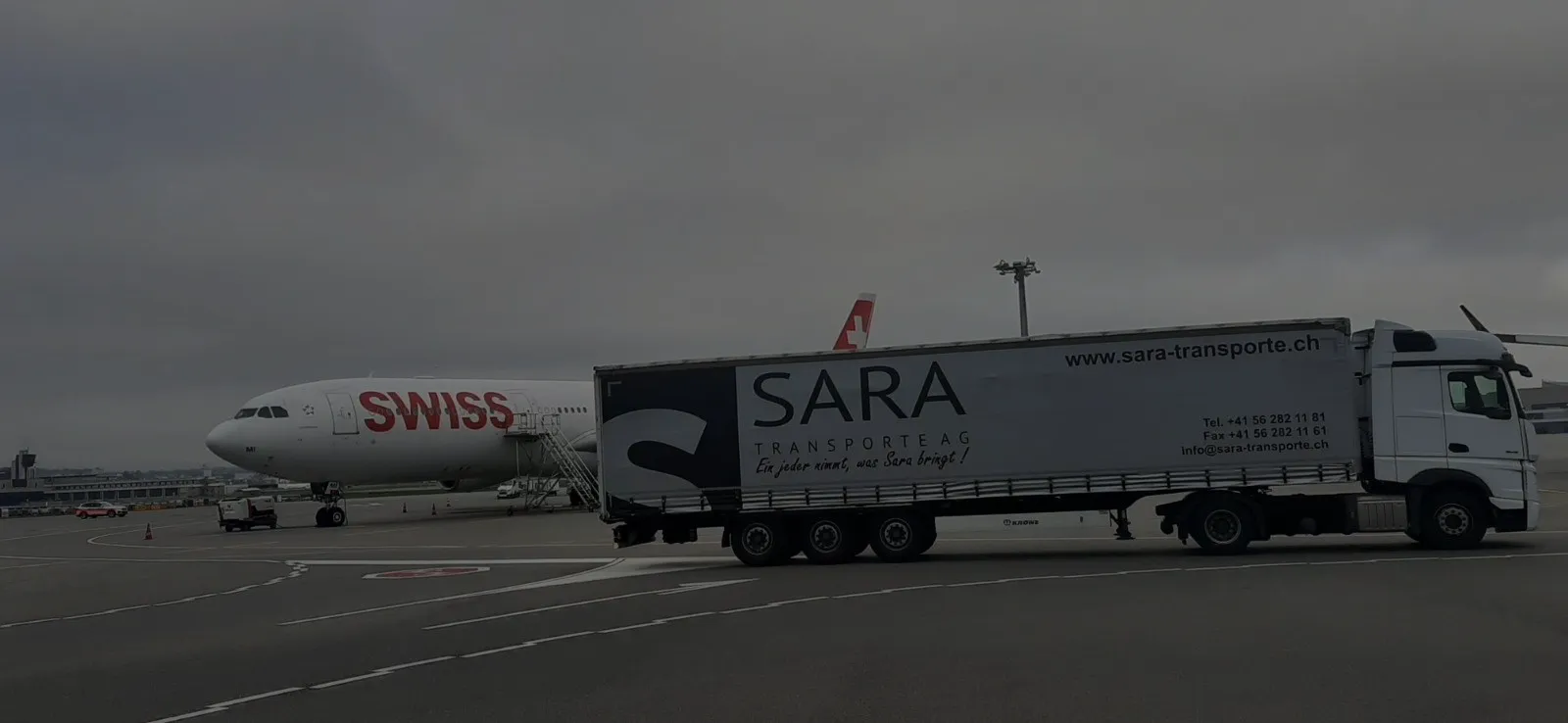
- Imagery Style: High-quality images showcasing efficient supply chains, global reach, and state-of-the-art technology were chosen to communicate Sara Transporte AG Logistics' capabilities and commitment to excellence.
